Cultural Bridge Homes
Bridging the gap by exposing you to different cultures, ideologies, experiences and walks of life.
UX/UI Product Designer
04/2023 - 06/2023
-
Cultural Bridge Homes Overview:
Cultural Bridge Homes operates an exchange program facilitating connections between host families and foreign exchange students.
Program Objective:
The primary goal is to enhance the efficiency and effectiveness of the matching process for both host families and students.
Challenges with the Original Mobile Website:
Found to be clunky, cluttered, and overwhelming.
Information was scattered and not easily accessible.
Redesign Objectives:
Improve user-friendliness for both host families and students.
Present clear and concise information in an organized, easy-to-navigate manner.
Enhancements in the New Website:
Provide additional resources and tools.
Facilitate a more seamless exchange experience for host families and students
-
User Research and Usability Enhancement:
During the redesign process, I actively engaged in comprehensive user research and usability studies to pinpoint areas where users experienced overwhelm.
User Interviews:
Conducted one-on-one user interviews to gain insights into the challenges and pain points users encountered while navigating the original website.
Usability Studies:
Executed usability studies to assess the efficiency and effectiveness of the existing design, identifying areas that contributed to user frustration.
Iterative Redesign Process:
Following the initial research phase, I took the following steps:
Consolidation of Pages and Information:
Identified redundancies and complexities in the original design, leading to the consolidation of certain pages and information to streamline the user experience.
User Testing and Feedback:
Implemented the redesigns and conducted another round of usability studies and user interviews to validate if the changes successfully addressed the identified issues.
Validation of Redesigns:
Assessed whether the redesigns effectively met the intended goals of enhancing user-friendliness and reducing the sense of overwhelm.
Feedback Incorporation:
Incorporated user feedback into further refinements, ensuring that the final design not only met but exceeded user expectations
-
Small targeted user research
Reflected data into designs
Persona Creation
Journey mapping
Usability Studies to refine designs
Prototype testing
-
Utilized standard tools and practices:
Figma
Lo Fi Mock up
I laid out how I wanted to the pages to look, this is the third iteration of how they were supposed to look. I wanted to incorporate a vertical scroll and drop/inner shadows to produce a depth effect into my designs
Hi Fi Prototype:
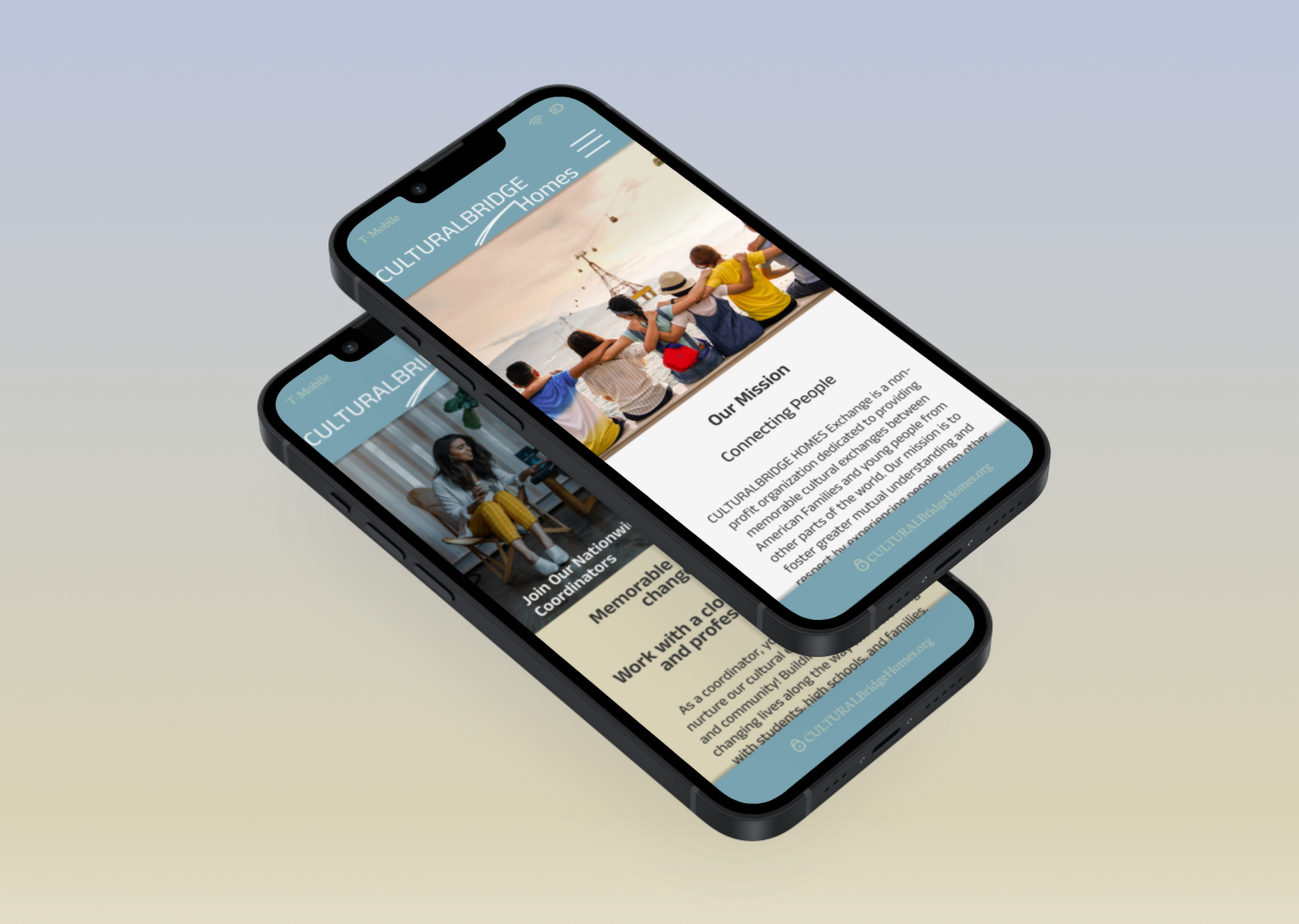
After another round of small user testing, I developed the mock ups into full prototypes. Since the main idea was to give potential host families information and I was tasked with implementing a better information hierarchy. Some of the peripherals such as the “contact me” form and “application” button do not land anywhere. I wanted to keep the user focused on the students and how the app/mobile website functions and if it can display information accurately and clearly with out overwhelming the user.
Unsplash
-
As a designer our designs are never truly finished. When the prototypes were coming together I would feel like the choices I made were suitable, only to come back the next day and see that there was room for improvement.
👇 One of the first redesign iterations involved changing the layout at the bottom of the home page. While words can be easily overlooked, pictures can captivate and attract users' attention. I aimed to use images that would entice users to click or tap on the thumbnail to see where it leads.
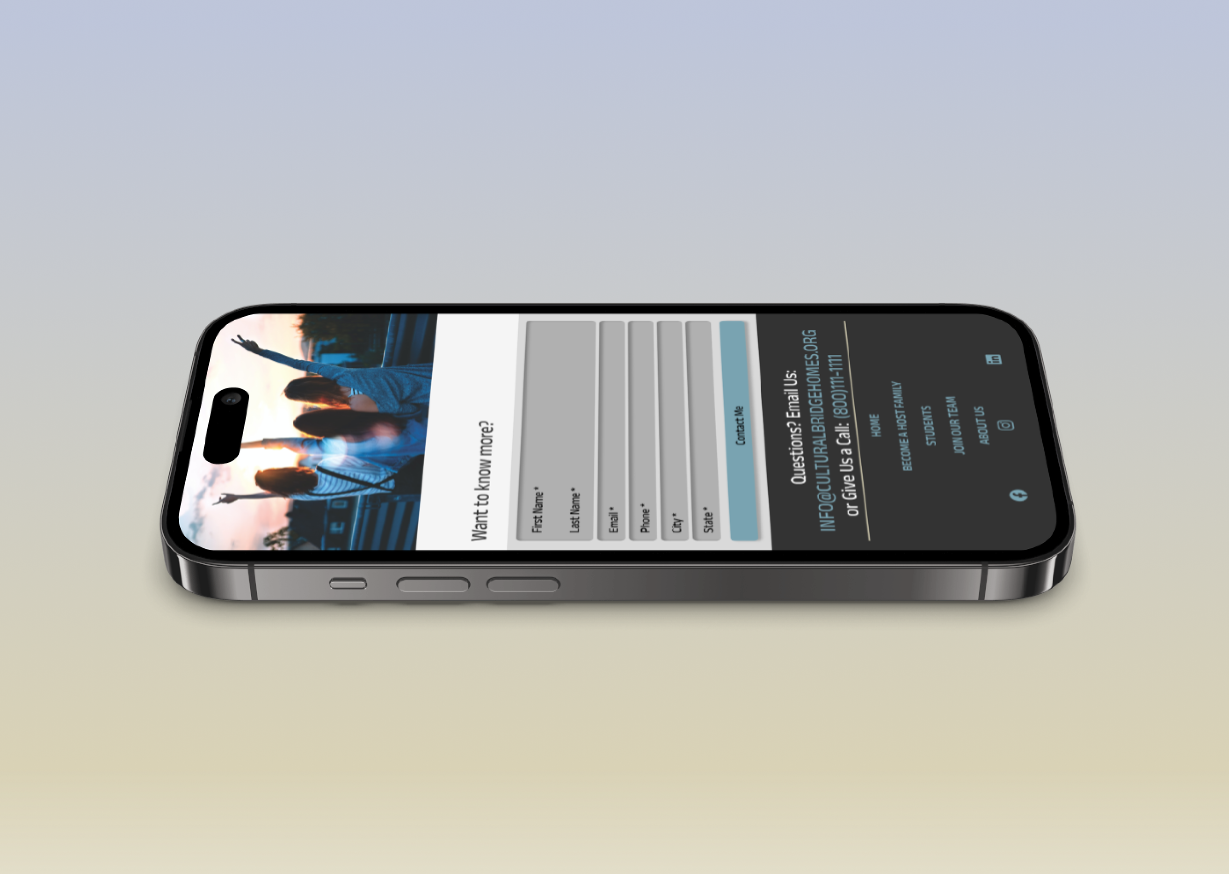
👇 The second major iteration of the home page involved changes to the color and density of the body paragraph. The previous shade of green was difficult to read and too small. The new blue color creates better contrast and is more visible when using a mobile device. Another major design change was the addition of a "contact me" form. Although the form is simulated and does not actually go anywhere, the user is prompted to make a choice when they see it, which helps to keep them engaged with the landing page. The page ends with a quick contact info menu and a navigation menu.
👇 For the last major design iteration, I decided to put the students on the same page instead of having a "meet our students" link that takes the user to a different page. This choice significantly reduces the number of screens needed, especially for a company with hundreds of students. The students can be displayed in a grid layout, and users can click on each to read a bio written by that student.
-
What I learned 📜 -
Challenges and Design Frustrations:
The project posed several challenges and design frustrations, creating a complex and demanding process.
Adaptation and Exploration of Tools:
Despite the difficulties, I successfully overcame these obstacles by:
Adapting to the evolving project requirements.
Exploring and incorporating new tools and techniques within the Figma design environment.
Commitment to User-Centric Design:
Throughout the design process, a key focus was placed on:
Prioritizing the needs and preferences of users.
Ensuring that every design decision aligns with user expectations.
Integration of Accessibility Considerations:
An integral aspect of the design approach involved:
Consistently considering accessibility factors in every stage of the design process.
Implementing features and elements that enhance inclusivity and usability for a diverse user base.
Benefits of User-Centric and Accessible Design:
The commitment to prioritizing users and integrating accessibility considerations resulted in:
Improved user satisfaction with the design outcomes.
Enhanced usability and functionality of the final product.
User Research 🔍
Usability Study ✒
To ensure that the goals were met and that no original pain points were missed during the design process, a usability study was conducted.
Major Design Iterations
This is the first design iteration. Placing a CTA at the bottom of the page to lead users where we want them to go. 👇
This is the second design iteration. Placing a CTA at the bottom of the page to lead users where we want them to go. 👇
This is the third design iteration. Placing a CTA at the bottom of the page to lead users where we want them to go. 👇
Final Product (Click to view) 👇
Have a project in mind? I would love to hear from you!


